Importance of typography

It may not feel like typography is that important, but it can have a major effect on your reader's experience. Typography is essentially the art and techniques for displaying your written words.
Typography can have positive and negative effects on your words without you realizing it.
Positive Effects of good typography:
- Keep the readers more engaged.
- Guide the readers focus to the more important content.
- Persuade your readers based on mood and feeling.
Negative Effects of bad typography:
- Disinterested in boring text.
- Exhaustion when it's difficult to read.
- Misleading or hard to follow.
Your reader's attention is the most important part of producing content. Think about how busy your reader might be. They have their own life and challenges. When they are offering their precious time and attention, you should make it easy for them. The less effort it takes for them to read, the more likely they will continue to read and provide their attention. Typography is not for you, it is for your reader.
Rules I learned for better typography
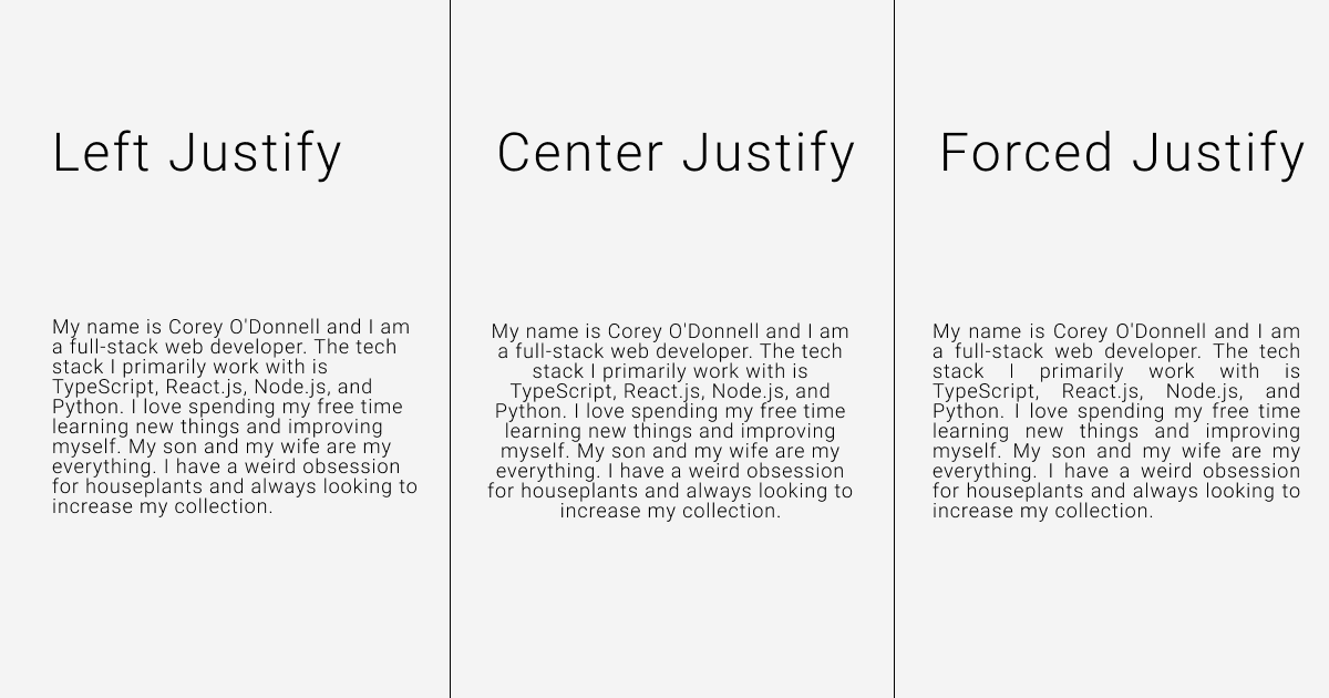
Try to always use justify left.
Most of your readers probably read left to right, top to bottom. Justify left will make this easier. Justify center only works with headings and things like invitations. It's also difficult to read when you have large paragraphs with difference sized rows. You should just stay away from forced justify. The spacing between words can leave rivers of spaces and look less appealing.
Use one font until you know how your fonts work together.
For every font you add, you need to understand more about typography. It is definitely possible to pick fonts that are complementary, but can be difficult. The best way to have them complementary is to use fonts with a different classification: serif, sans-serif, slab-serif.
Stay away from the goofy and monospaced fonts for body text.
Goofy can make it feel out of place unless it is follows your design. Monospaced fonts should be used for code blocks.
When choosing font weights, always skip a level.
fine/medium,light/bold,medium/extra-bold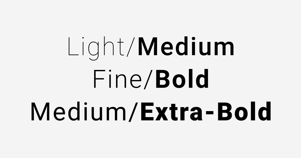
Always use multiples when choosing sizes for fonts and rules.
2x/4x,2x/8x,4x/8x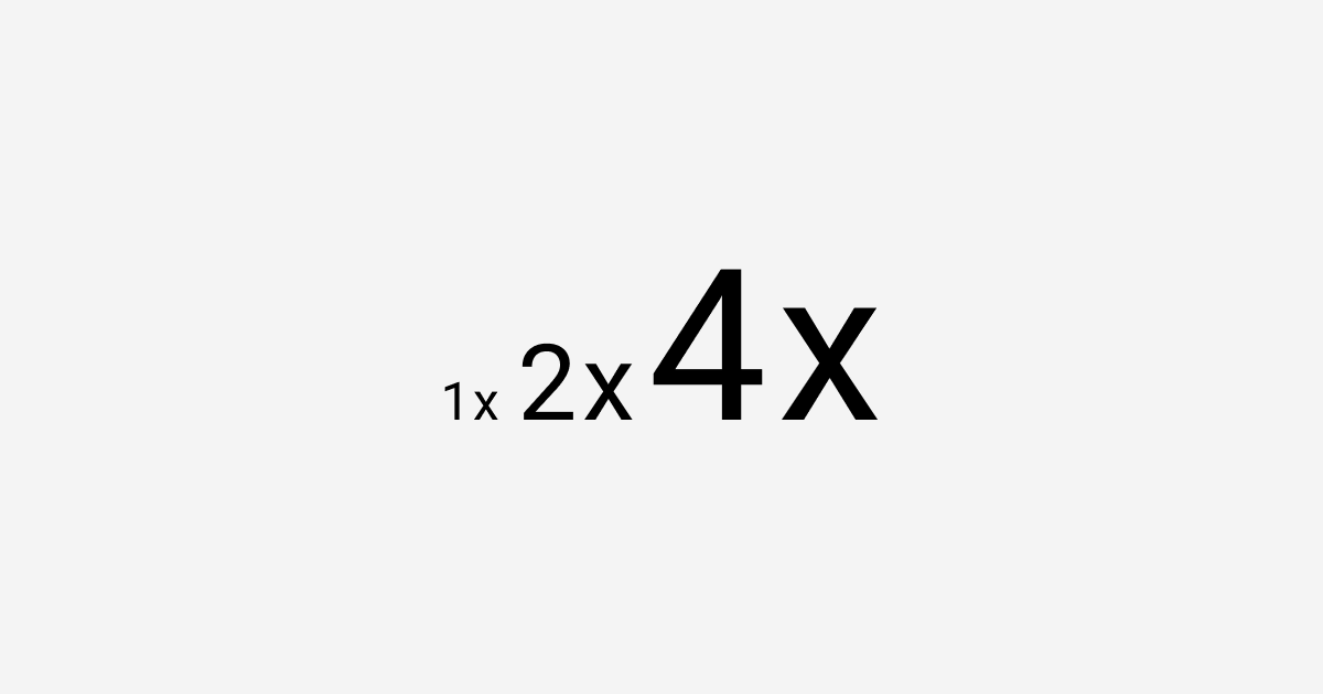
For body text on the web, stick to
15-25px.The line space should be roughly
120-145%.When using ALL CAPS, add extra letter spacing (
5-12%).Do not be afraid to play around with it. Just make small incremental changes.
Do not be afraid of negative (empty) space. Give your reader some room to breathe.
I am still learning and will continue to add more rules to my list. Maybe we can compare and share as you learn also.
Sources
- Butterick's Practical Typography: Web Book
- The Futur's Typography Manual: Youtube Video
- Follow me on Twitter for random posts about tech and programming. I am also documenting my journey learning design.